Disclaimer: Please consider that these designs are not my property. This file and the information it contains may be confidential or be legally privileged. It is intended solely as a reference for my work. You should not copy it for any purpose or disclose its contents to any other person. Finally, if these contents are downloaded, please delete once they are reviewed. Thank you.
CRO / Registration Funnel Investigation
Overview
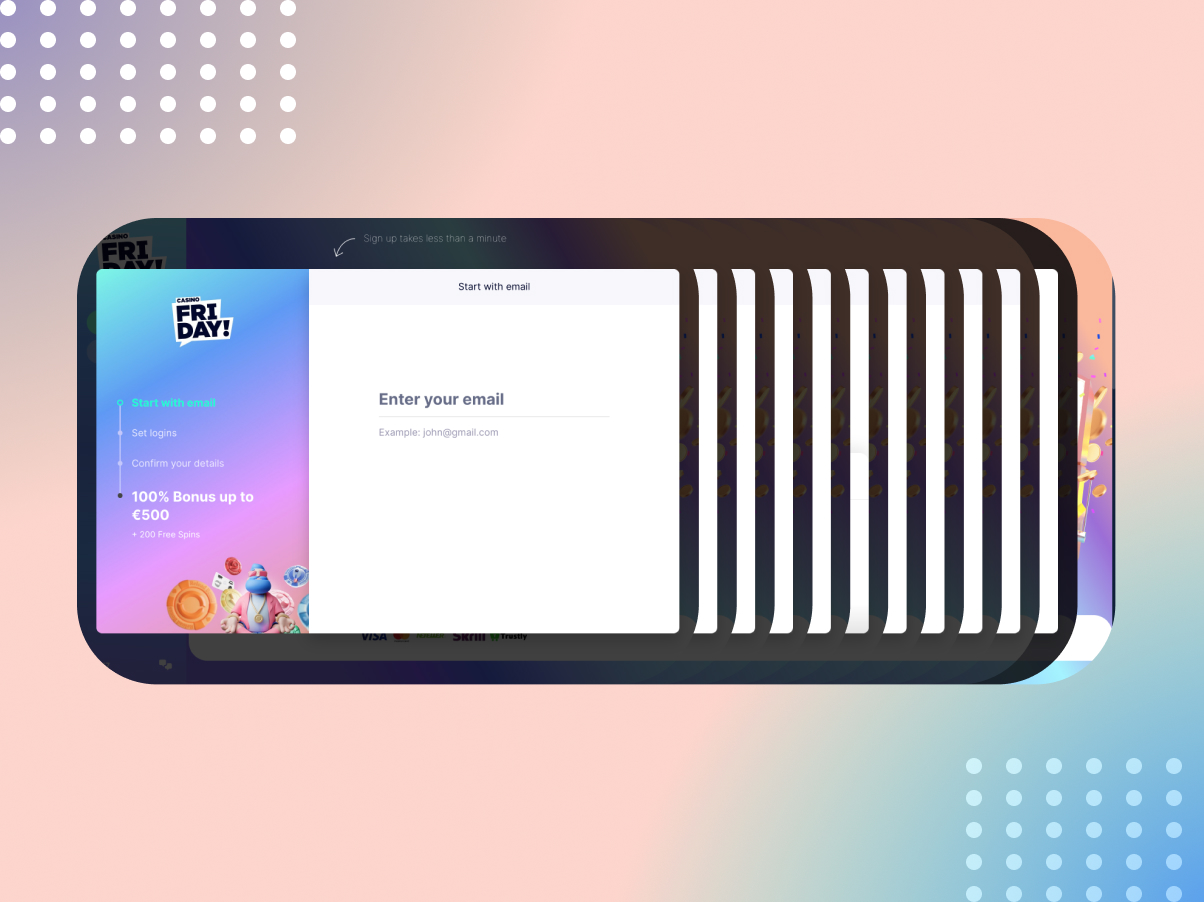
In this project, I undertook a CRO and Registration Funnel Investigation for an online casino, aiming to enhance the user experience and boost conversion rates.
My Role
Leading and overseeing the investigation. I collaborated closely with cross-functional teams, including product managers, developers, and brand designers, to ensure a holistic approach to improving the registration funnel.
The Challange
- Competitive Landscape: The online casino industry is highly competitive, with numerous alternatives available to users. This heightened the urgency to optimize the registration funnel, as a seamless onboarding experience could be a differentiating factor.
-
Conversion Data Analysis: To understand the challenge better, I delved into conversion data. We identified a drop-off point at the registration form, where a significant number of users were abandoning the process. This was our primary challenge.
The Process
1.0 – Best Practices
Throughout the process, I adhered to industry best practices in registration form UX and CRO. These practices served as a foundation for decision-making and guided the direction of the project. It ensured that our approach was grounded in proven methodologies, ultimately leading to a more user-friendly registration funnel. Find out more details on this UX Source article.

2.0 – Competitor Research
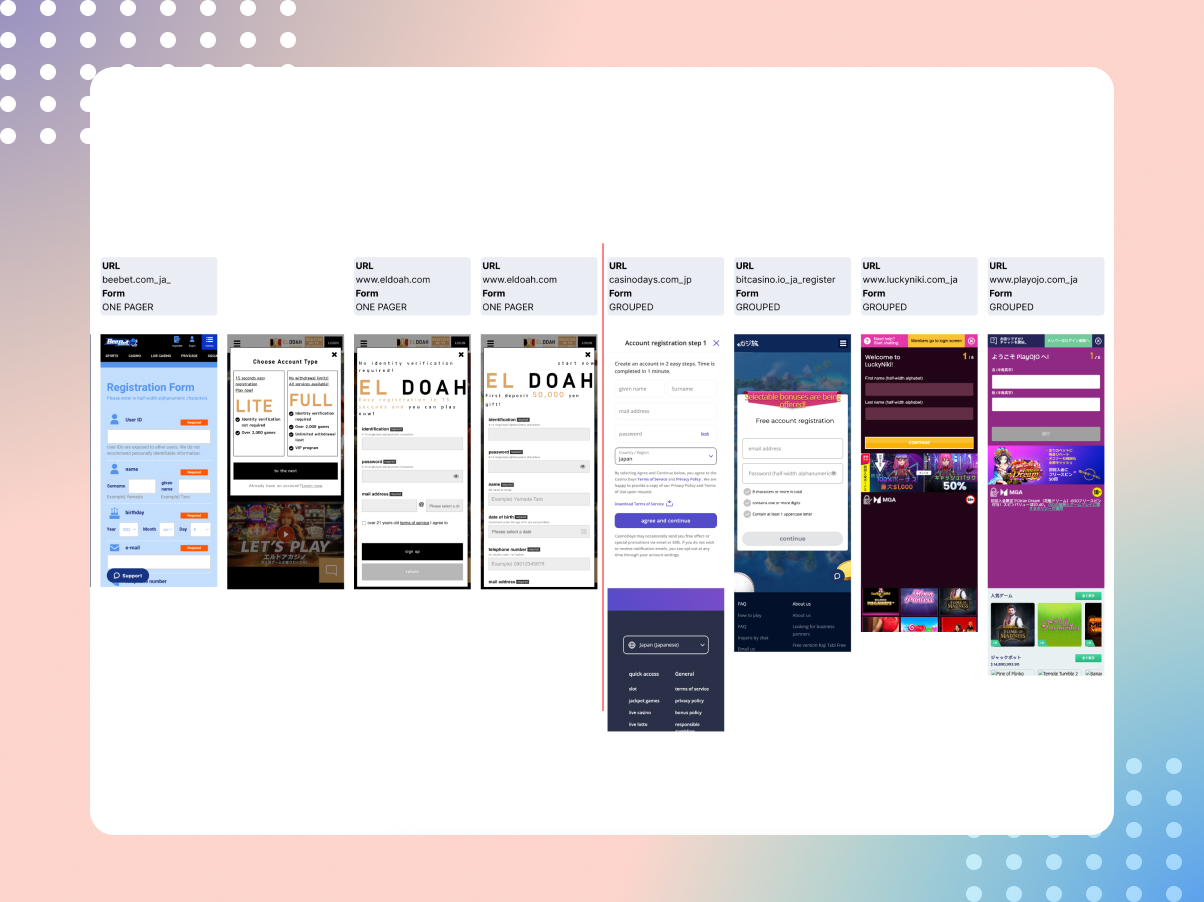
To gain a comprehensive understanding of the competitive landscape, I conducted extensive research into top competitors across multiple geographic regions. This involved:
- Identifying Top Competitors: I identified the key competitors in various geographical markets to benchmark our online casino against them.
- Categorizing Competitor Strategies: I categorized the strategies employed by competitors into different types, such as Step-by-Step registration processes, Grouped forms, or One-pagers, based on their registration flows.
- Company Jurisdictions: I researched the legal jurisdictions under which each competitor operated, as this influenced their registration requirements and processes.
- Social Logins: I investigated whether competitors offered social login options and, if so, which social platforms were integrated.
3.0 – Data
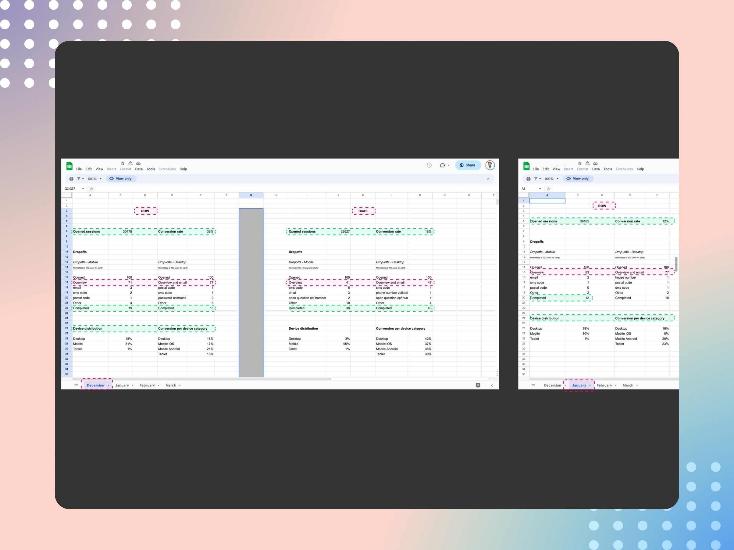
I collected and analyzed data over a three-month period to inform decision-making. The key data points included:
- Opened Sessions: Tracking the number of users who initiated the registration process.
- Dropoffs: Identifying the points in the registration funnel where users abandoned the process.
- Devices: Analyzing the devices used by users during registration to optimize the user experience across different platforms.
- Conversion Rates: Calculate the conversion rates at each step of the registration process to pinpoint areas for improvement.
4.0 –Current Journey
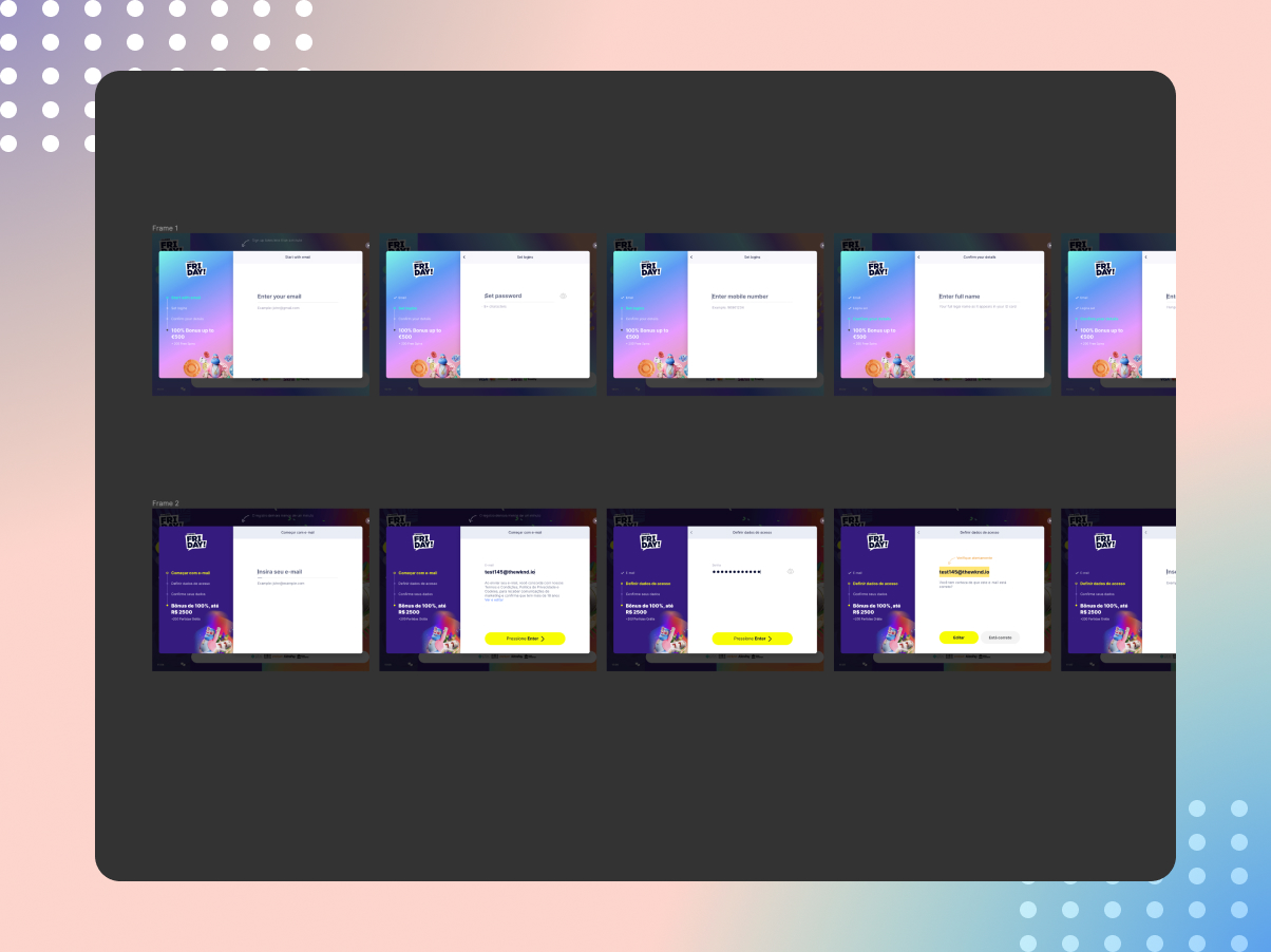
I meticulously documented the existing registration journey in a market-by-market map. This map provided a visual representation of each screen and link in the registration process, helping us understand the user’s journey from start to finish.
5.0 – User Research (Part-1)
To gather valuable user insights, I conducted unmoderated design surveys. These surveys allowed us to collect user feedback on proposed changes and gather suggestions for improvement directly from our target audience.
1458 players were tagged from Sweden (31), New Zealand (3) & Canada (27)
Deposited >100 in the last 30 days, logged in at least once in the last 14 days
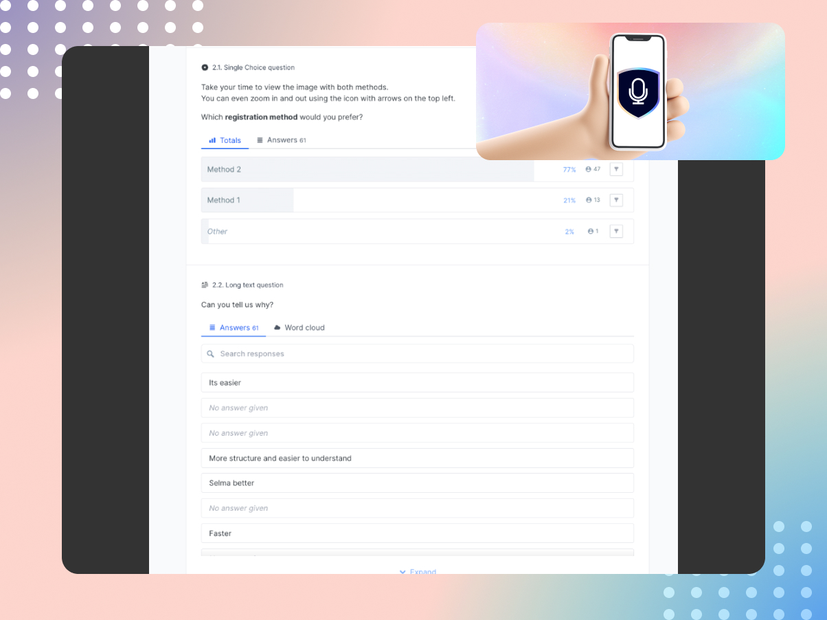
61 responses received
- 8.15% response rate (with no reward!) 🎉
- From customers who Played Daily / Weekly
- Most interested in real and free play
Our Users Prefered
- Method 2 – A split Reg process (70%)
- Quick Sign-up – Would Use (70%) or think they might (+20%)
- Google – as their preferred method (75%)
5.1 –User Research (Part 2)
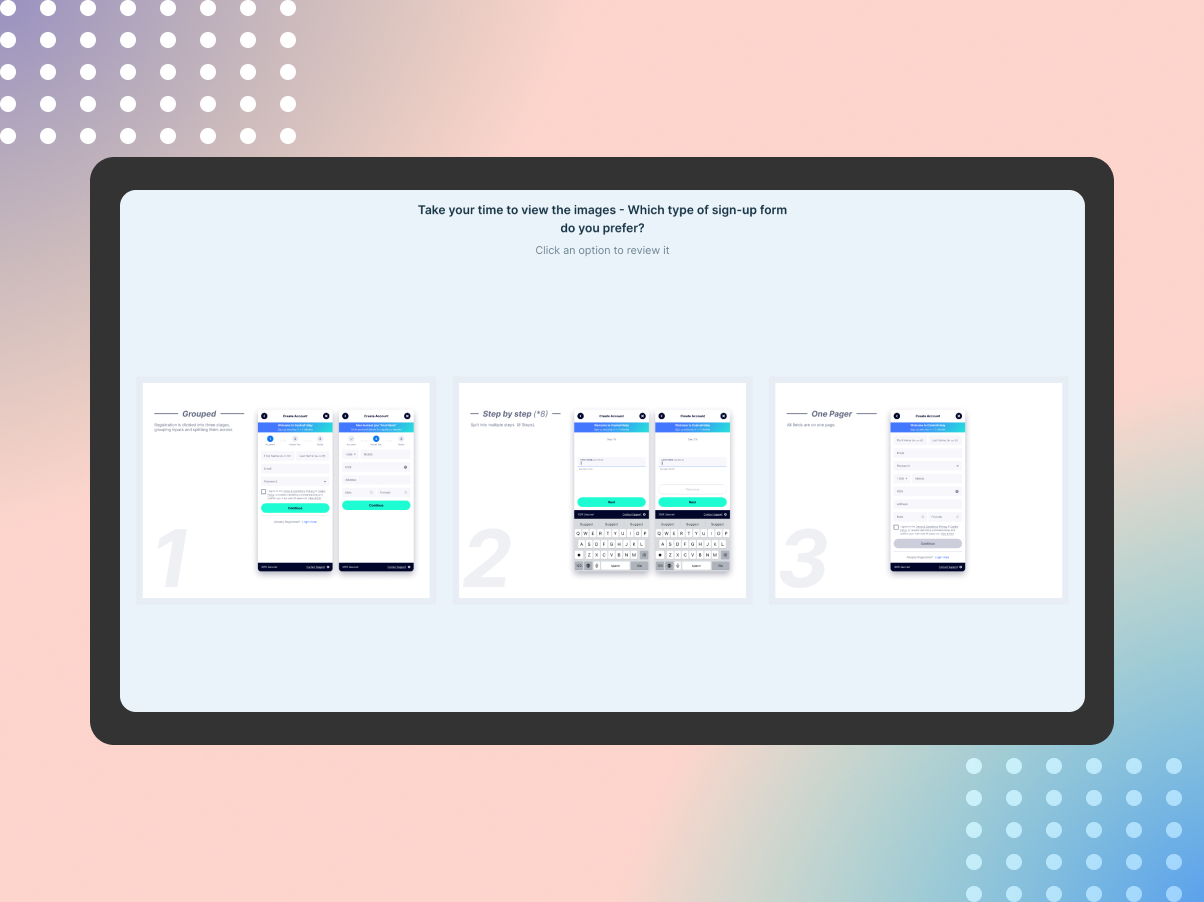
I ran another two-week unmoderated design preference survey, directly with our users. I investigated user preferences among various sign-up methods: Grouped, Long Form, and Step by Step.
Results indicated a preference for Grouped (49%) and Single Page (41%) formats, praised for their simplicity and convenience.
37 responses received from a chat message shared to about 800 logged-in users.
- ≈ 4.44% Conversion (Sent)
- ≈ 8.96% Conversion (Opened)
- ≈ 48.05% Conversion (Clicked)
5.3 – Observations & Next Steps
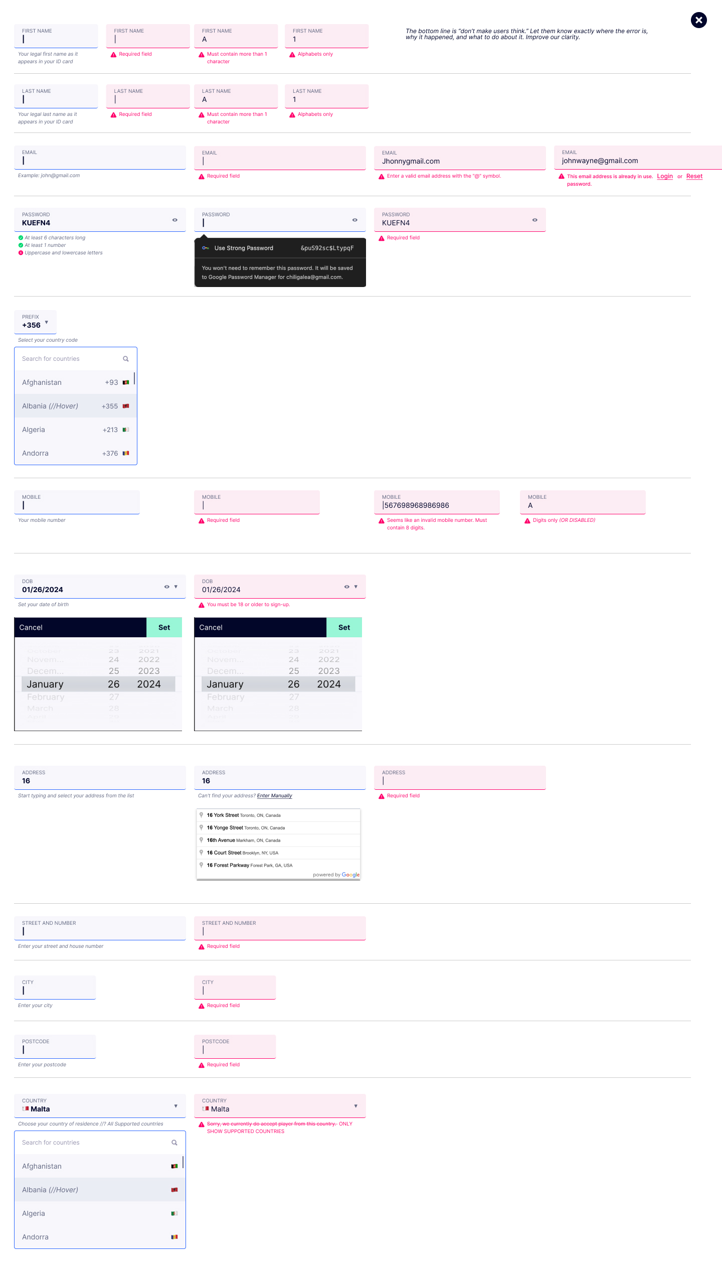
Given the close comparison between the grouped and single-page versions, I advocate for adhering to fundamental principles to develop either format for production confidently. Emphasizing clear UI component type by state that guide users through the process while prioritizing validation and error handling is paramount.
The overarching objective is to minimize user cognitive load, ensuring they are promptly informed of errors, their causes, and appropriate actions to resolve them, thereby enhancing overall clarity which should lead to better overall success metrics.
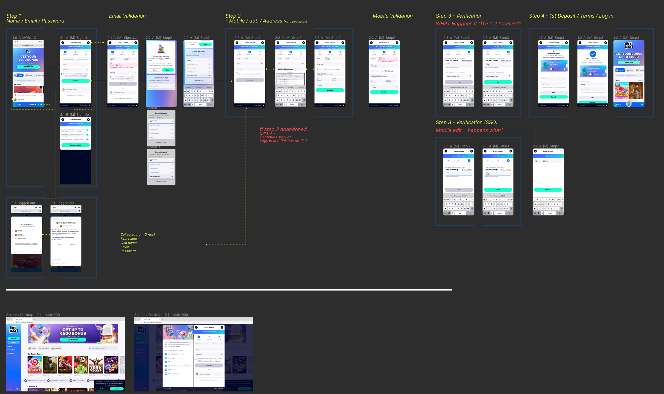
The Solution
(High-level flow)
Results
In spite of our diligent efforts and the promising improvements identified through the Registration Funnel Investigation, the implementation of these enhancements was regrettably put on hold. This decision was driven by ongoing operational challenges, delays from external suppliers, and, ultimately, the closure of our target markets. While the investigation yielded valuable insights and solutions, unforeseen circumstances prevented us from pushing these improvements live to benefit our users.
No way, really thanks for making it this far! Here’s a gif for you!
